College Compare
The problem:
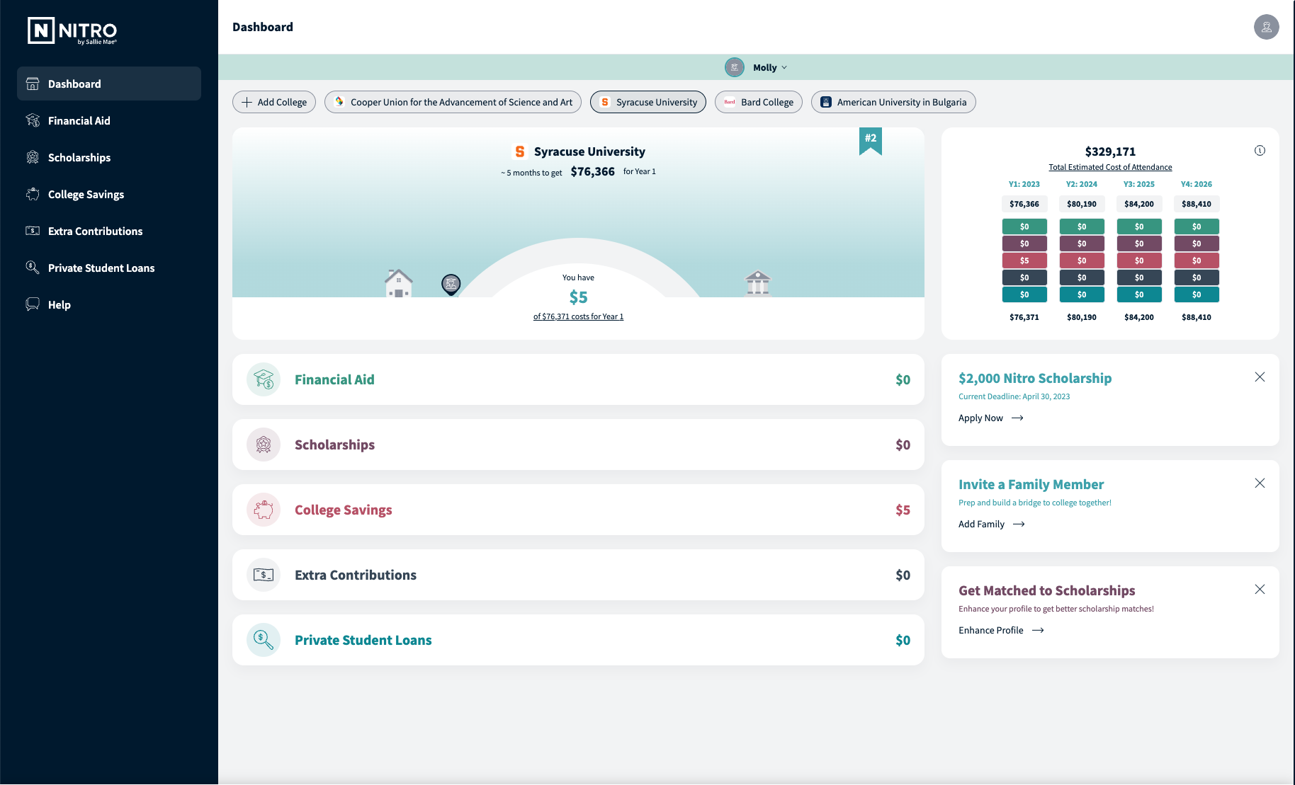
Nitro Next was a browser-based application, shown here, intended to allow students and parents to keep track all the money they had set aside for college and get matched with personalized scholarships tailored to their interests. The buckets tracked included scholarships, loans, grants, and family contributions. While students and parents found this tool helpful, it was still missing the mark.
Analytics also showed a drop off in engagement after initial sign-up. Research showed families in the college selection process used a variety manual ways to help themselves decide between their college choices. Nearly all admitted there’s no singular go-to tool that assists in this time consuming and stressful decision. Many users would find a couple scholarships, then not use the app for months.
Enter our College Comparison dashboard - an added feature to the existing application intended to solve these problems.
Goals:
Business, consumer and design
Business goals
Improve engagement with Nitro Next members in the form of more frequent log ins and greater number of actions taken per session
Ensure as smooth of a delivery and development process as possible for speed to market
Customer goals
Consolidate the fragmented process of finding money for college. Scholarships, loans, grants, and family contributions—typically scattered across various online tools and spreadsheets— aggregated and stacked up against actual college costs
Design goals
Simplify and organize a usually complicated process
Leverage visual representations to help digest the financial picture
Collaborate with developers during build for a quality design delivery that covers all their questions and user scenarios
Concept 1:
College Row
Featuring a filtering system at the top, this is where users would control the college view and see their funding by school one at a time. Staying true to the original branding, “add college” button was updated to follow the logic of the primary button styling.
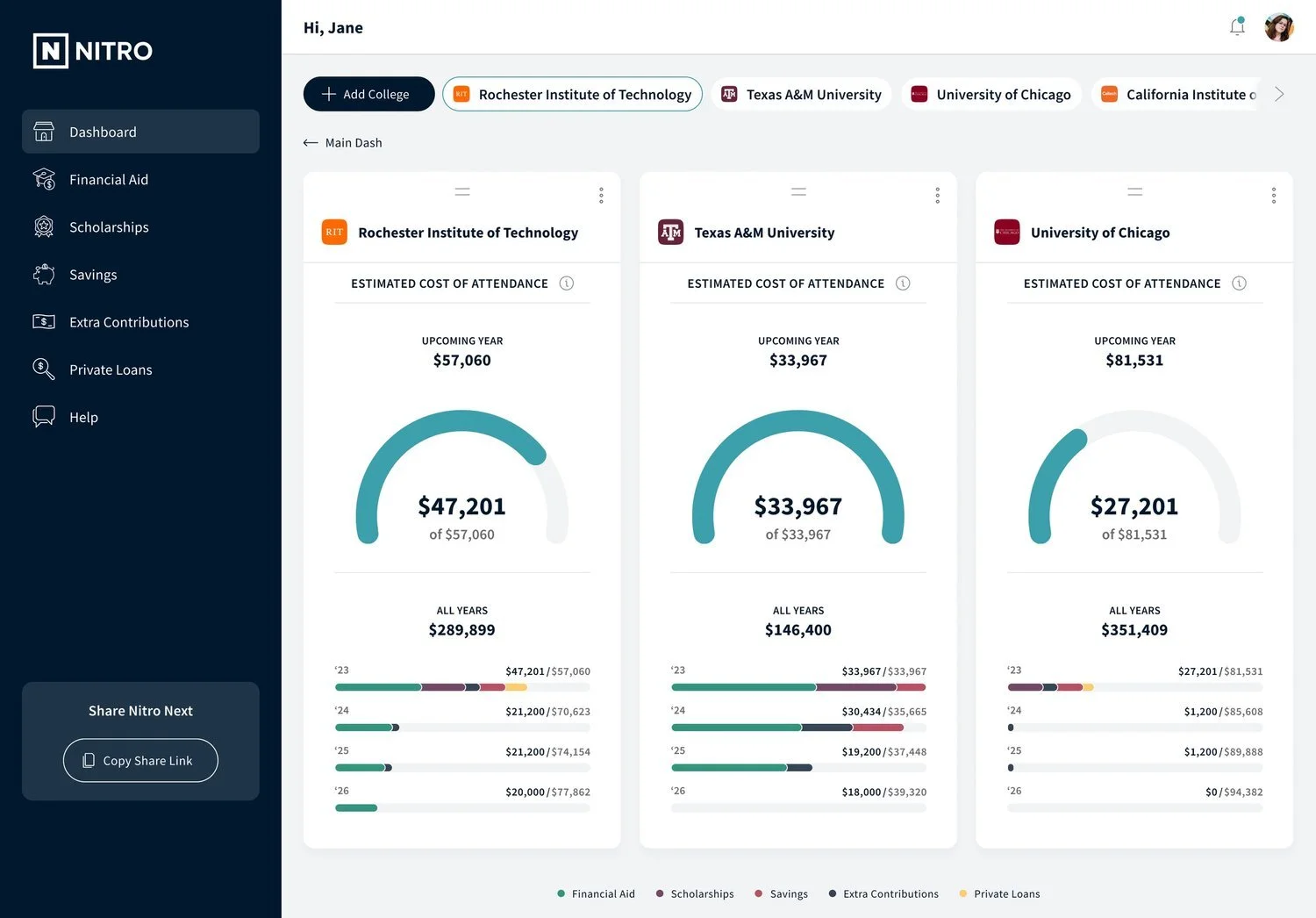
To compare colleges the user would need to expand the second panel. This would reveal all the colleges they had added within their set. From here they would be able to select up to 3 of their chosen schools to compare.
We streamlined the data visualization to be more consumable, by removing the home and school icons and opting for a more traditional circle graph. The 4 year financial overview chart, and bar graph were consolidated into the main dash reducing user confusion. An added color key provided additional context and clarity.
The dashboard heading was swapped with the user account name. This added personalization and with the right navigation the user still had an indicator for where they were in the experience.
Concept 2:
Dropout
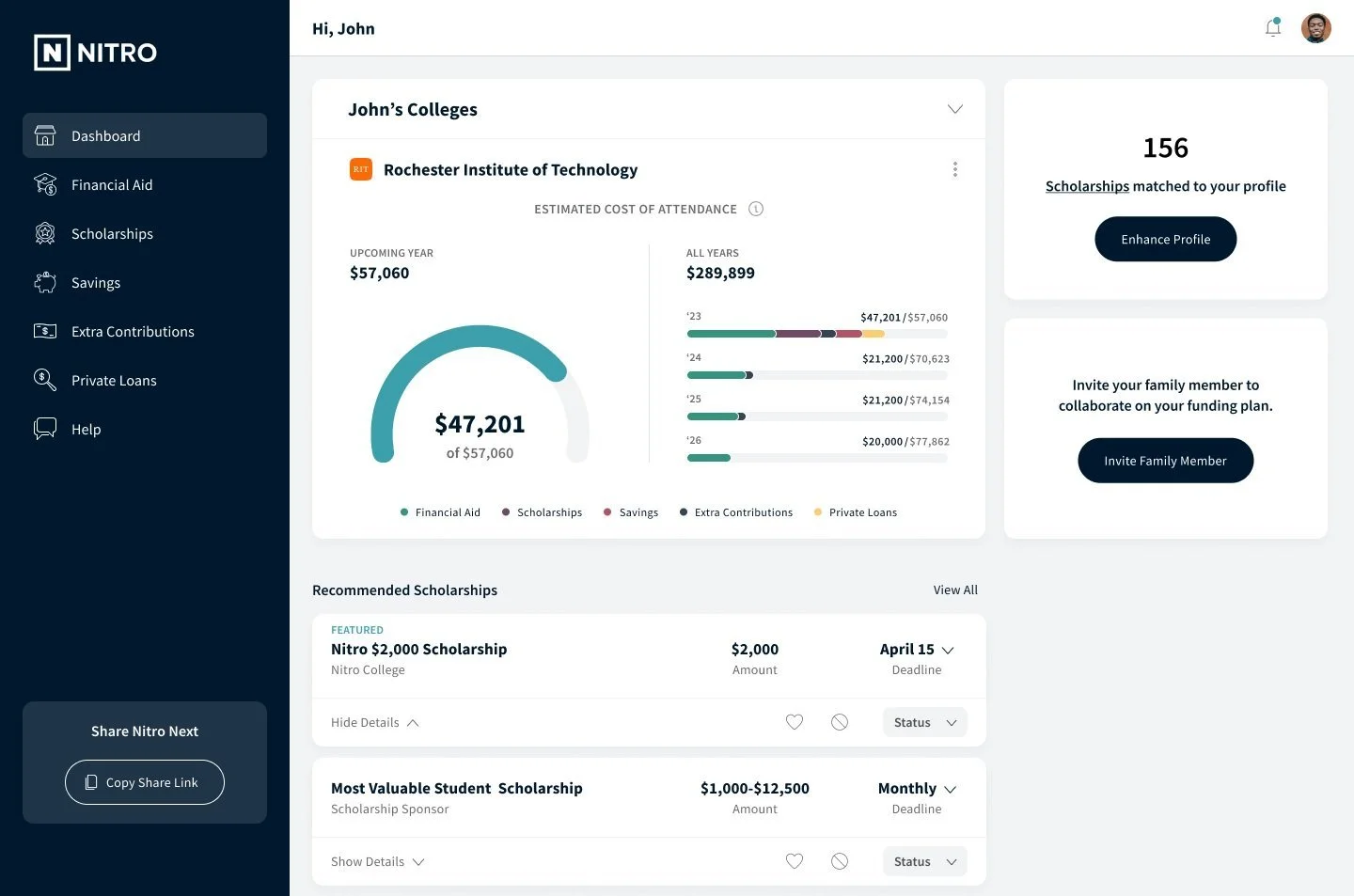
The second concept didn’t contain the top filtering system from the original design. Instead we chose a carrot drop down that would expand the main dashboard and reveal the college set. From there they could click and expand each college to get the 4 year financial overview of that specific college.
Should the user want to compare their options they would would then need to click the “compare” button to reveal the checkboxes. Then they would be able to select up to 3 as in the previous design.
As in the first concept this dashboard also contained the consolidated data visualization to provide clarity.
Testing:
Round 1
Participants
Current undergraduate students
Participated in financial planning for school
Used some sort of tool for planning (spreadsheet, notebook, etc.)
Scenario
We asked participants to
Describe the process they went through to understand how their funding matched up to their potential school costs
Act as a helper for “Jane” and “John” (alternating order for each participant) to use the Nitro prototypes to help understand the financial situation (how much from various sources; how that funding applies to the upcoming year; how that funding applies to the duration of the college attendance)
Set-Up
1:1 moderated sessions on Usertesting.com
Testing using two Figma prototypes
Alternated presentation
Total of 8 sessions
Overview
College row results
College Row is helpful in letting people orient on the schools - there is a strong relationship between this control and the graph display.
The graph display was universally considered to be very useful and was easily interpreted. Several participants expressed delight at seeing “Invite Family Member”.
Recommended Scholarships were very helpful to participants, who commented on the challenges of finding scholarships in general.
The graph display was consistently interpreted by the participants as showing the 1 year and the 4 year funding-to-cost relationship.
The key was slightly difficult to discover, but participants found it very helpful; one participant had slight colorblindness and found it challenging to distinguish among the key/graph colors. The Upcoming Year graph’s color was associated with Financial Aid.
Estimated Cost of Attendance: Participants expected a robust (similar to what the graph display is showing) display of what goes into arriving at that number. “Final Decision” was considered by all participants as not quite the right language.
Manage & Compare is useful and easy to understand and use, but lacks a strong connection to College Row and the graph display.
Participants understood they could select colleges to compare, though not all participants discovered the selection limit of 3.
Participants understood they could rearrange the school by dragging/dropping, and most thought that being able to sort high/low or low/high would also be very useful.
All participants expected to see a different, side-byside display when using “Compare”.
Participants were delighted to see this kind of sideby- side comparison. When asked “how many schools should one be able to compare on a screen like this,” most participants suggested 3 or 4 as a maximum.
Participants understood that they could drag/drop to reorder the cards.
Participants understood the kebab menu to be where they would go to “flag” a school as a choice, or to delete the school from the display.
Some participants expect to be able to choose a different school from College Row and have it appear in this side-by-side comparison.
All participants were able to return to the dashboard without challenge.
Dropout results
The College Card was well received, but there were some challenges with participants understanding that the card can be expanded.*
The graph display was universally considered to be very useful and was easily interpreted.
Several participants expressed delight at seeing “Invite Family Member”. Recommended Scholarships were very helpful to participants, who commented on the challenges of finding scholarships in general.
When expanded, the College Card was very well received, as it maintained a much stronger relationship between the schools, information, and the graph display.
The Add College action was hard for participants to discover.
The Compare function was easily discovered, but participants found it to be somewhat cumbersome.
Participants understood they could rearrange the school by dragging/dropping, and most thought that being able to sort high/low or low/high would also be very useful.
After activating the Compare function, participants understood the 3 school limit very easily.
The change in the Compare control from its previous role as Add College was confusing.
Participants were delighted to see this kind of sideby- side comparison.
When asked “how many schools should one be able to compare on a screen like this,” most participants suggested 3 or 4 as a maximum.
Participants understood that they could drag/drop to reorder the cards. Participants understood the kebab menu to be where they would go to “flag” a school as a choice, or to delete the school from the display.
Some participants expect to be able to choose a different school from College Row and have it appear in this side-by-side comparison.
All participants were able to return to the dashboard without challenge.
Recommendations from A/B Testing:
Combine the College Card from the “college row” example with the Manage & Compare style from the “dropout” example.
This preserves the strong college ranking, information, and graph display associations, and allows a lower-threshold compare ability.
Dropouts side-by-side was somewhat easier for participants to work with - the drag/drop and kebab menu affordances were more easily discovered, and the separation of the cards allowed for stronger retention of which information belonged to which school.
Testing:
Round 2
In a series of interviews, our research team shared the prototype with our audience cohort of 100 students and parents at varying stages of the college search.
First, they were asked how they’re currently managing the school selection process. Then, they were shown the prototype, exploring all of the features - the college list, the expanded view with cost breakdown, and the college comparison view.
Afterwards, they polled the cohort on how functional they found the dashboard, both quantitatively (rating) and qualitatively (verbal response). Next, the cohort explained what features stood out the most to them and why. Lastly, they shared any questions or concerns.
Results:
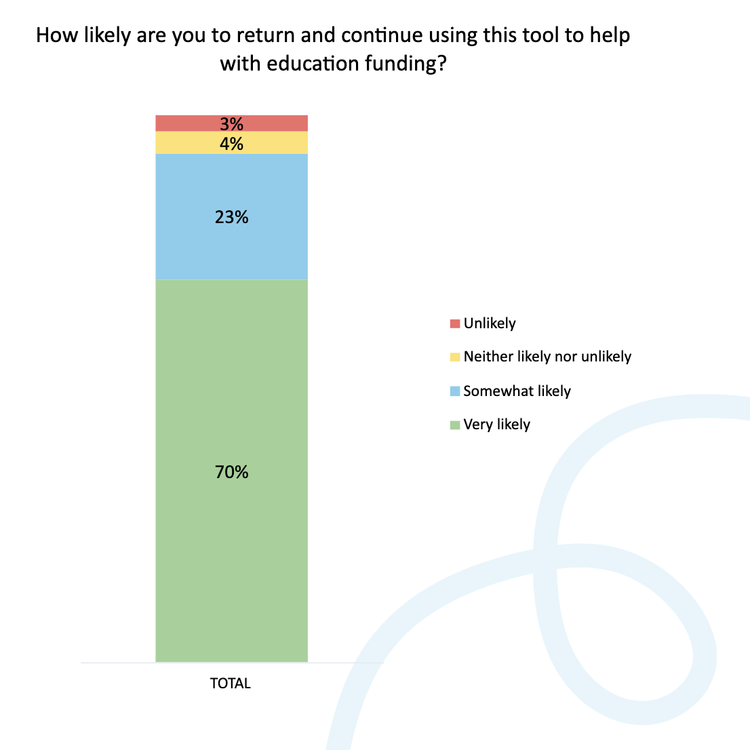
Overall, 7 out of 10 members would return.
More specifically, of high school students 74% were “very likely” to return, and parents of high school students were 68% “very likely” to return.
A favorite function
The college cost comparison was the favorite function, with the visual financial breakdown and scholarship sourcing as close seconds. Our new features made the college process very real, by clearly showcasing the true cost of college. The financial side was no longer a "worry about it later" concept - our audience saw real value here.
80% (n=72) of reviewers found the dashboard “very useful”. In addition to the excellent quantitative ratings, users gave verbal feedback as they walked through the prototype. While results were very positive, reviewers also desired more personalization. This could include the ability to add financial variables dependent on the person's situation (e.g. books, housing, food) to ranking preferences, to choosing the the way data is presented (graph vs. pie chart).
Quotes from user testing


