Design system libary
The problem:
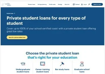
Sallie Mae’s ecosystem includes a number of platforms, experiences and two recent acquisitions. At such a scale, the design system was fragmented and inconsistent.
An initial design system by a hired agency was not responsive, accessible, nor truly meeting the needs of the brief—and ultimately our digital users. We needed to fix the system and help develop “Sallie’s” new brand in digital.
I was the owner of the new system and in charge of ensuring that components were built responsively and to best practices. This involved auditing and implementation of new brand elements to ensure ADA compliance as well as establishing a naming convention and building out a token library.
Goal:
Establish a design systems
Build a foundation based off of atomic design
[atoms, molecules, organisms, templates, and pages.]
Atoms are UI elements that can't be broken down any further and serve as the elemental building blocks of an interface. Molecules are collections of atoms that form relatively simple UI components. Organisms are relatively complex components that form discrete sections of an interface.
Overview
Laying the ground work:
Design (and development) work can be created and replicated quickly and at scale.
Alleviates strain on design resources to focus on larger, more complex problems.
A unified language within and between cross functional teams.
Creating visual consistency across products, channels, and (potentially siloed) departments.
Serves as an educational tool and reference for junior-level designers and content contributors.
Brand focus group validation
Our internal research team validated the brand team’s new concept moodboards with our audience cohort of 100 students and parents, giving us a base direction to expand upon.
Scoping and needs analysis
Current audit: Many current type and color styles were skipped altogether in day to day, real use contexts. They worked in theory, but not in reality.
Needed greater range of type styles for longform reading, authenticated platforms, and complex UI patterns such as form fields, calculators, and tables.
Type - audit
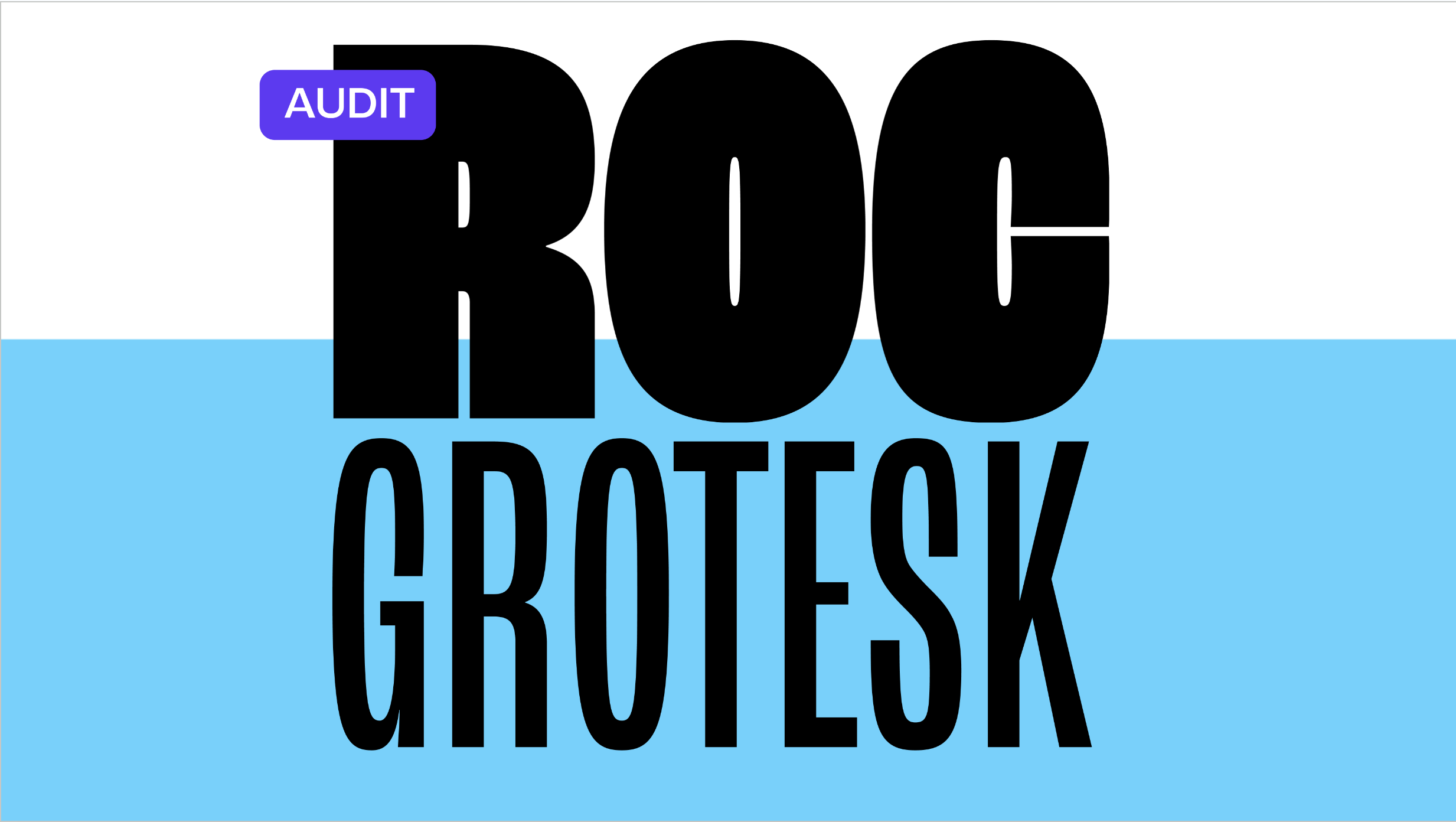
Brand wanted to migrate Graphik to Roc grotesk, but this posed some challenges as these are not a one to one swap.
Roc Grotesk worked well for display and marketing. However we needed to consider additional practical use cases, especially in core products involving complex UI and the display of financial information. We needed a web-friendly workhorse and a readable serif; we added Open Sans and Lora.
Testing and validating:
Typography
We established an initial set of styles on a modular type scale, then applied them to sample web pages and UIs made with our design system in Figma to see if they actually worked in context.
We iterated in context until styles:
Accommodated needs across platforms, components, and use cases with minimal redundancy and confusion
Demonstrated hierarchy, harmony, and emphasis
Type in Tokens
Starting with primitives, then semantics and finally on the component level, we built out a naming convention first that worked with our established logic with our DEV partners. Once established we began implementation of said tokens at scale within the design system.
Working in tandem with DEVs ensured a smooth handoff. Particularly of importance at SallieMae who has four different tech stacks all working in tandem with different code bases.
Color - audit
Working with brand we then began exploring color options that we thought might work within both spaces testing and validate along the way.
We started with an ADA audit and overview of the current palette and the challenges it posed within the system as it stood today. From those initial pain points and our research on GenZ we provided three recommendations as a starting point
Testing and validating:
Color
The dreamer palette was the starting point, and working out from there we the business wanted strong blues to make up the primary pallete.
We iterated in context until styles:
Aligned with ADA needs and to digital best practices.
Had enough tints and shades established to ensure accessibility, UI needs while remaining consistent.
Met WCAG contrast accessibility and to outlined rules around what colors and combinations might work best as text, background, and accents.
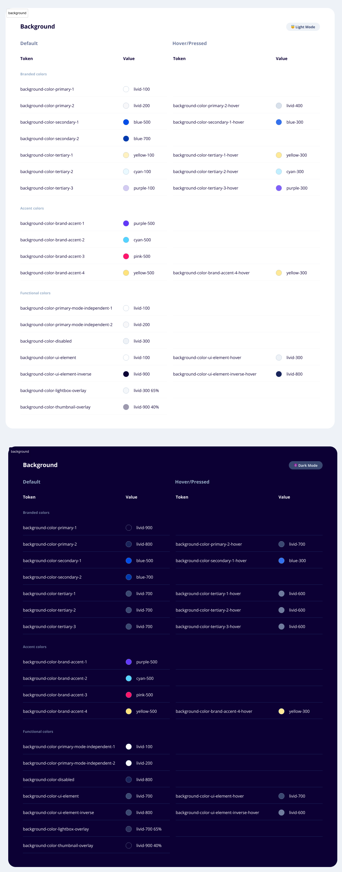
Color in Tokens
Working again with our DEV partners we began the tokenizing process for a second time. With this work also came establishing a dark mode, to later apply within our atomic design system.
Results:
A collection of reusable components, guided by clear standards, that allows our organization to manage design at scale.
Including the library of fonts, colors, and interactions that bring our brand to life across the entirety of the customer journey.
A solid color and type foundation for Sallie’s new digital brand, with the blog and website first up in the pipeline
Minimized risk of fragmentation across products
A feedback loop and work flow process with development to enable further evolution, growth, and enhancements
A living, evolving document and singular source of truth that all designers and developers can explore and experiment in


