Landing page redesign
The problem:
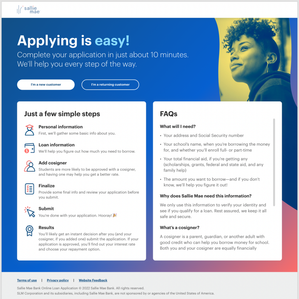
The current state experience shown here had a 64% drop off rate..
Our entire timeline totaled 4 weeks. This included design & concept, testing and DEVs handoff. For the sake of speed to market we conducted a heuristic audit and hypothesized the following areas would be our quickest wins:
Clearer language and visibility for the headline. Providing context on what they are applying for.
Buttons needed more visibility as well. CTA verbiage adjusted to indicate what action they are about to take (ie: apply now, get started, log in etc.)
Guided content and FAQs should be made secondary by exploring progressive discloser. This wall of text is overwhelming in it’s current state.
Week 1:
Discovery and design
This time was spend exploring 3 concepts to solve the major pain points outlined above. The brand had evolved since the previous design was made, so we also needed to adjust style to align with the new branding guidelines.
Concept 1:
Clarity
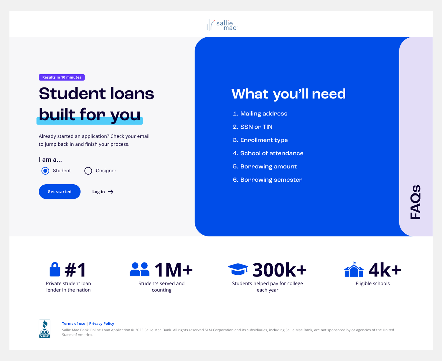
The first concept aimed to increase white space and create visual interest with social proofing, full color imagery and actionable items. The “few simple steps” were omitted from this design.
The user would be greeted with a title that lets them know they’re here for a student loan, results in 10 minutes in the eyebrow eludes to simplicity and ease without inundating them with too much context.
The button has presence on the page, while radio buttons allow them to choose a student or cosigner path. Returning user CTA was moved below, and made secondary to the primary actions.
FAQs were then placed below the fold, available should the user be looking for additional information, but far less overwhelming.
Concept 2:
Hide out
With the benefits of option one, this layout had more interactive element when disclosing the additional content.
A wallet like concept with expanding panels would reveal additional content without information getting lost. “A few simple steps” was renamed to “REQs” to match “FAQs” verbiage.
Only obscuring the hero image when opened, ensuring the user would always be able to engage the CTA. The secondary CTA was then shortened further to simply “Log in” for additional testing data.
Concept 3:
Undercurrent
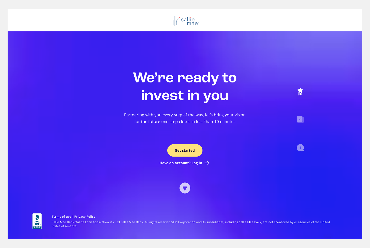
A design moonshot that went as minimal as possible. Video looped in the background adding visual interest, while the content was displayed front and center.
A side navigation was added with icons, that could either be clicked or moved through by scrolling down the page.
The CTA remained in place but as the user moved through the experience this allowed for a moment of brand personality, changing as they progressed by section, prompting them to begin their loan.
Week 2:
Testing
Undercurrent was ultimately chosen and we moved forward into A/B testing and validation. We tested two styles of on page navigation, one with text labels and one with icons from the original concept.
Overview
Research Goals:
To see how confident users are to move forward with the application process. We wanted to learn about peoples’ expectations about the very start of the online student loan application process. Including:
What they expect to see / learn
What would make them progress / abandon
Interactions with the navigation
Methodology
Conducted 2 sets of unmoderated user testing on Usertesting.com.
1. Undercurrent with Icons Desktop
2. Undercurrent with Text Desktop
Conducted 2 sets of moderated tests.
1. Undercurrent 2.0 Desktop
2. Undercurrent 2.0 Mobile
Audience
Unmoderated:
• 20 users total (5 borrowers and 5 cosigners per test.)
• College students who currently fund their schooling through Private Student Loans.
• Cosigners who fund borrowers through PSL.
• Based in the United States.
Moderated:
• 16 users total (8 new customers and 8 serial borrowers)
• College students who currently fund their schooling through Private Student Loans.
• Based in the United States.
Insights:
Users appreciated the simplicity and clearness of the page.
It was clear to users what action they need to take to move into the application.
Most users who read the "10 minutes" line positively received how quick the application would take.
Users didn't know they could interact with the icons, they moved right into the application instead. However, when replaced with text, some users clicked on the CTAs and interacted with the content.
Users who interacted with the rail had trouble understand what REQs meant, but when clicking on it stated that having requirements listed was helpful
Week 3/4:
Production and Implementation
The next stage of development was to implement insights from user testing and connect with risk partners on final design.
Text was the user favorite, and hover animations made it more intuitive for the them navigate the experience.
The purple video was replaced with blue which has a stronger association with trust.


